Decant Product Design · Fortna · 2025
Creating a Universal Warehouse Product
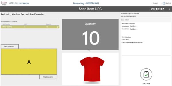
Warehouse operators were struggling with a decanting workflow that was slow, confusing, and error-prone. Customer complaints included "this task takes too long," and "the steps are confusing." These inefficiencies compounded at scale, impacting throughput, training time, and overall operational cost. I led the end-to-end redesign of this module, transforming a fragmented workflow into a streamlined, intuitive product experience that significantly improved speed and usability.
- Company
- Fortna
- Role
- Senior UX Designer
- Duration
- 8 months
- Methods
- User Research · End-to-End Design · Concept Testing · Figma · SaaS · B2B · Warehouse
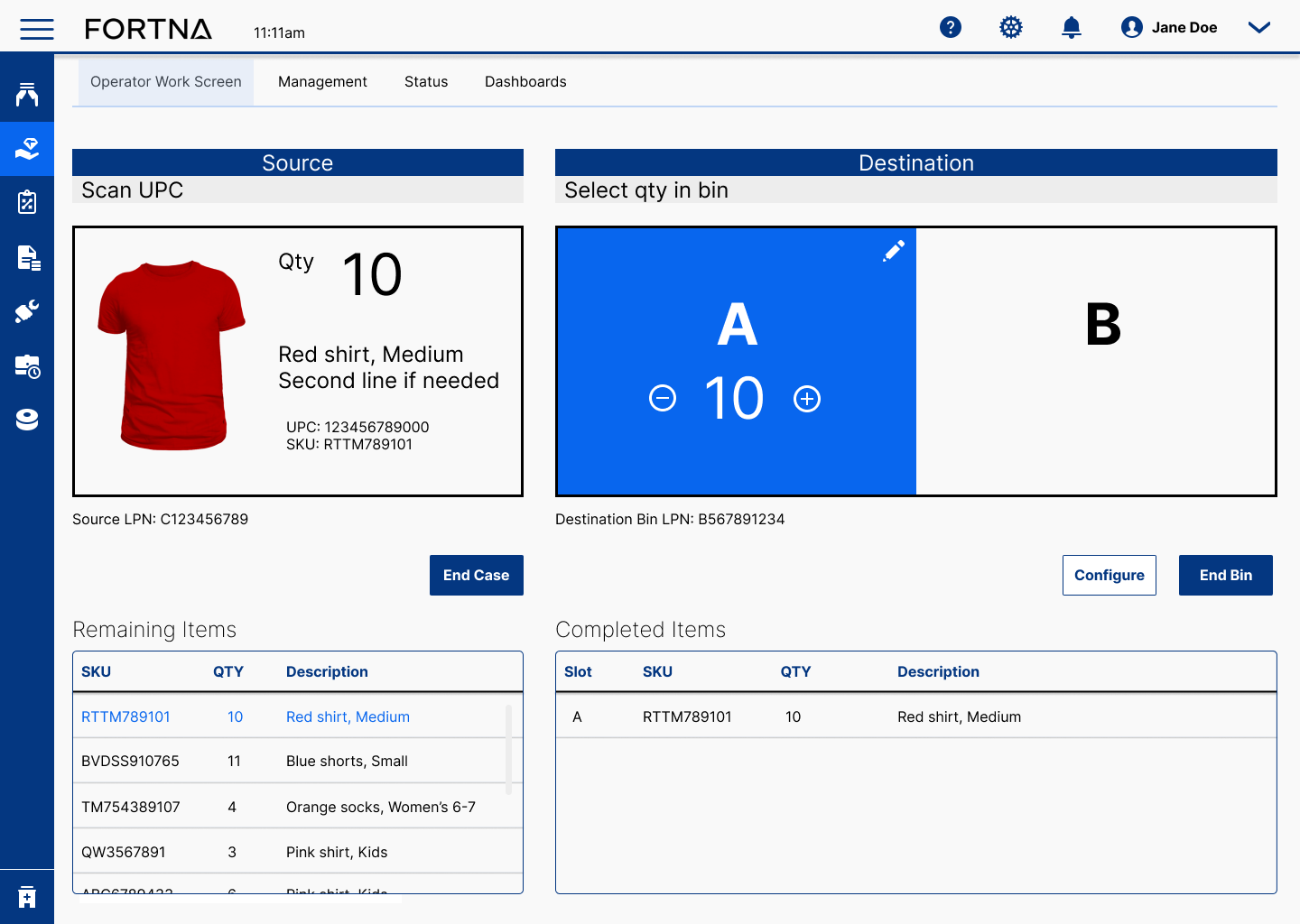
Strategic Recommendation
Reduce the number of screens and actions available to the operator at one time, based on where they are in the task, using the progressive disclosure design technique to guide the workflow.
Business Outcome
36% faster processing, 52% fewer clicks, 45% fewer screens per task.
My Role
Sole Senior UX Designer and Researcher
- Led user interviews, onsite and remote.
- Defined user workflow and information architecture.
- Designed wireframes and high fidelity UI.
- Conducted A/B Testing and Usability testing.
Define
One product for many warehouses
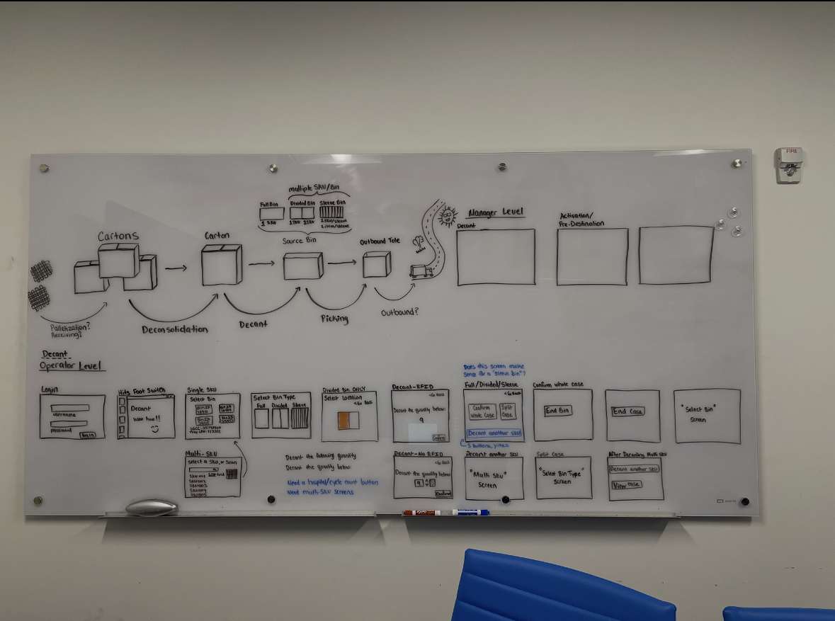
Before I designed the universal decant product, Fortna was operating on a project level, designing and developing a different decant module for each client. This approach was time consuming, inconsistent, and costly. As a member of the product team, I was tasked to design one product that could be implemented at several, unique, customer sites. Some of the customers were Macy's, H&M, and Amazon. I had no warehouse experience, so my first objective was to understand more about the warehouse space, and the different ways a client could operate their decant module.
- Understand warehouse spaces, logistics, and procedures.
- Be aware of system limitations.
- Define the end goal: a modern system for warehouse workers to pack orders for stores and end consumers, usable by several clients and customizable with configurable options.
- Define common exception flows and exception handling instances.
Research
Understanding the operator and their environment
Once I knew more about the warehouse environment, how decant fits into warehouse operations, and our backend limitations, I wanted to know more about the end user. In this case, the end user is an operator in a warehouse who packs orders that are shipped to retail stores, or consumers who buy online orders. I wanted to understand more about the warehouse environment. The lighting and how it affects the screen glare, the size of the screens, if the operator is standing or moving around at their workstations, where are the incoming cases vs. the outgoing bins, and how big are their workstations. I did a site visit to Macy's to clarify those questions, as well as the points below.
- Conducted on site user interviews to understand operator pain points of the current project design.
- Researched the most used actions needed for the operators.
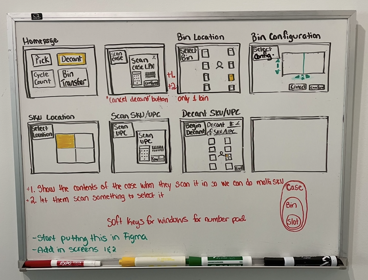
- Sketched low fidelity wireframes to ideate layout concepts.
- Developed workflows alongside product managers to account for edge cases and exceptions.
Design
From wireframes to a shippable product
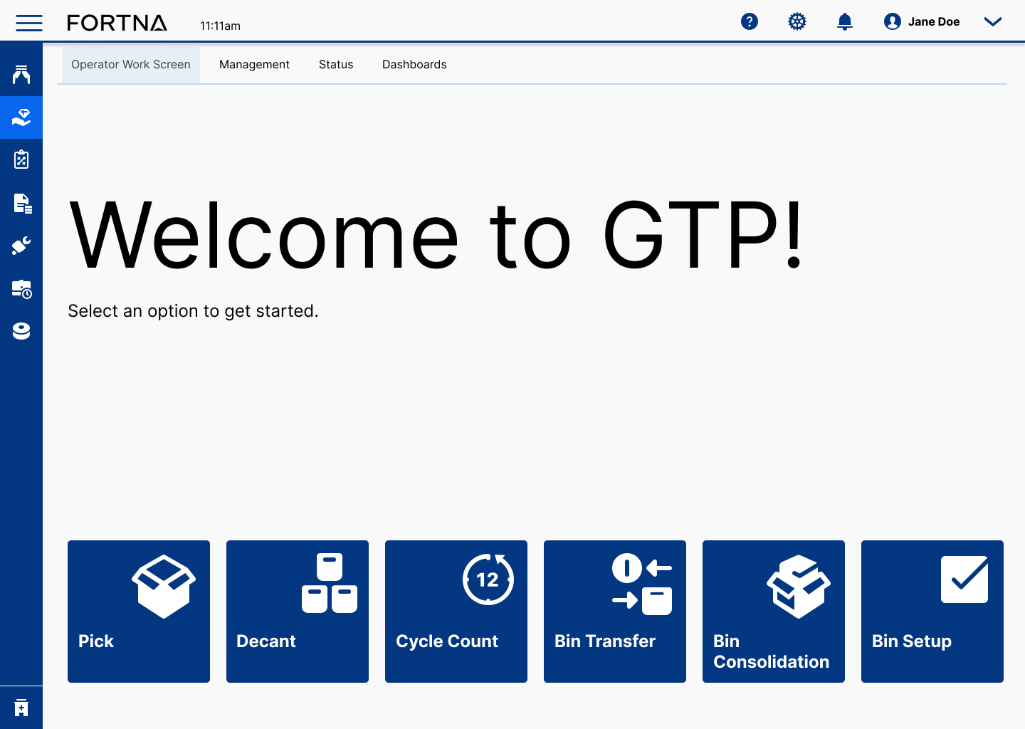
This is the part of the end-to-end design process where analysis paralysis can take over, and I have to move on. There is a lot more that I could research about the end user, or about the different edge cases for different clients, but those things will have to be addressed in later iterations. At this point, I open Figma, start a desktop frame, fill in the navigation and side menu, and design from top down and left to right, adjusting sizing and colors as I initially fill in the page. I consulted with other designers on the team who had different modules to productize to ensure consistency. I created new components and added them to our design library as I went along. I had several meetings about icons. Icons are tricky. At some point, I was tired of looking at decant, and wanted to rest my eyes on another screen, so when I would get stuck on decant, I'd work on the new landing page for WES (warehouse execution system). This was a great exercise in iconography, and a fun way to be creative at work.
- Created clear workflows for user needs without detailed requirements.
- Iterated design concepts with product and software teams to develop useful experiences, while advocating for end users.
- Gave presentations to internal Product Stakeholders, often defending designs and re-iterating unclear elements.
- Created a new menu and icons just for fun and the PMs loved it.
Validation
Moderated Usability Testing
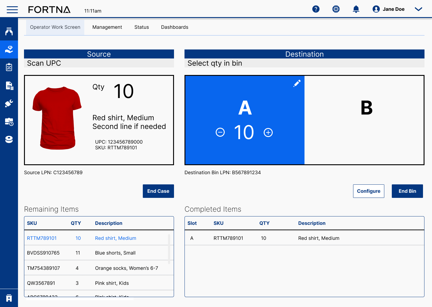
After staring at decant for months, I started to wonder if any of this works. Is any of this intuitive. Is any of this helpful. The answer was yes. I could not test the product with actual end users, another site visit was not in the budget, but I could test the new product with Product Managers, and other people in the office. I printed out pictures of red shirts, orange socks, blue shorts etc to mimic the items that an operator would scan and decant into bins. I placed the stack of paper cutouts in a "source case" and placed a "destination bin" on the other side of the person doing the test to recreate the operator workstation as best I could. Then I had the "operator" use my laptop as an operator screen, clicking through the necessary prompts that would show up on screen. Any time they "scanned" a SKU with their phone, I advanced the screen the way it would advance after implementation. Not only was the new product more visually pleasing, it was faster to use, and more intuitive because I surfaced the call to actions.
Results
A shippable product with measurable gains
I designed a product from end-to-end that Fortna could sell to all of its clients that need a decant module. In addition to a new product, I also made noteworthy improvements that were discovered through testing. The new experience resolved customer complaints, including "this task takes too long," and "the steps are confusing."
- 36% reduction in average processing time per task.
- 52% fewer clicks and 45% fewer screens per task.
- New-operator ramp time cut from 3 weeks to 9 days.
- Support tickets related to the workflow dropped 61% in the first quarter.
Reflection
Reframing for the human
The most important deliverable wasn't the redesign. It was the shared understanding that the workflow was optimized for the wrong audience. Reframing that let Engineering make different architectural choices downstream.